The Main Museum - Brand Identity Design
Expressing the ongoing process of institution-building through a museum’s visual identity
Crafting Identity: Designing a Bilingual Visual Brand for LA's Main Museum
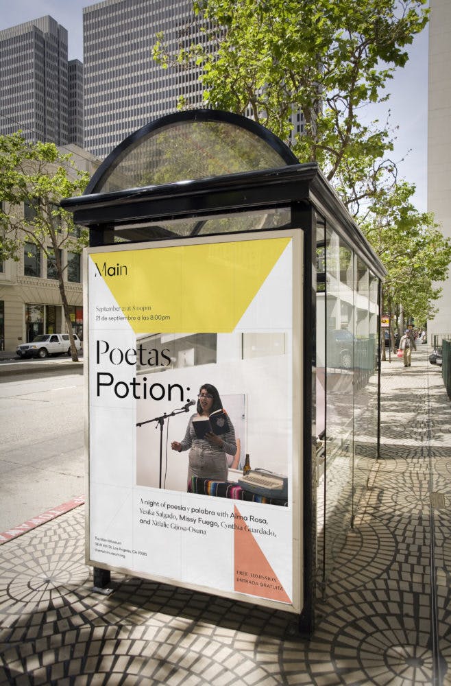
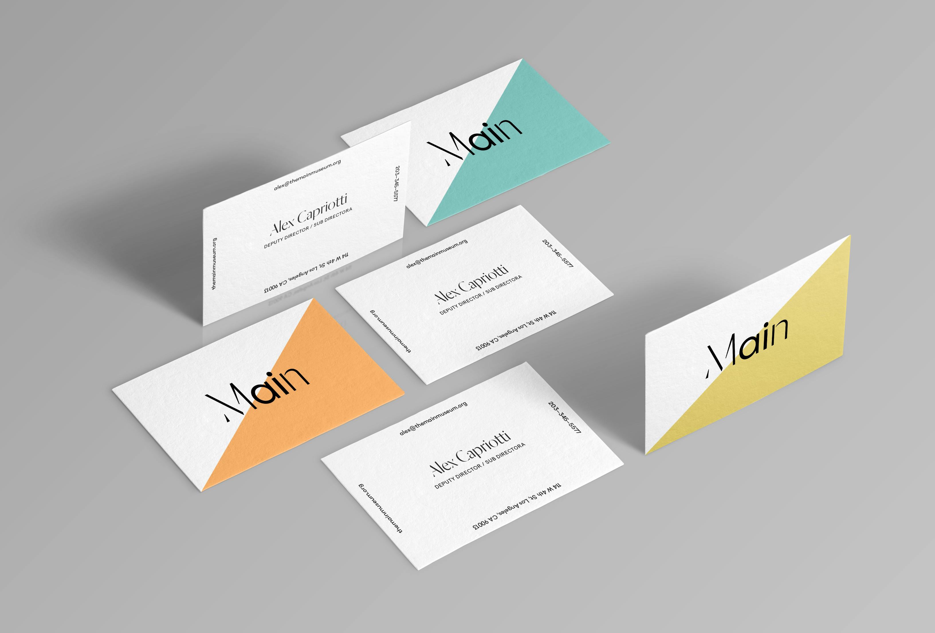
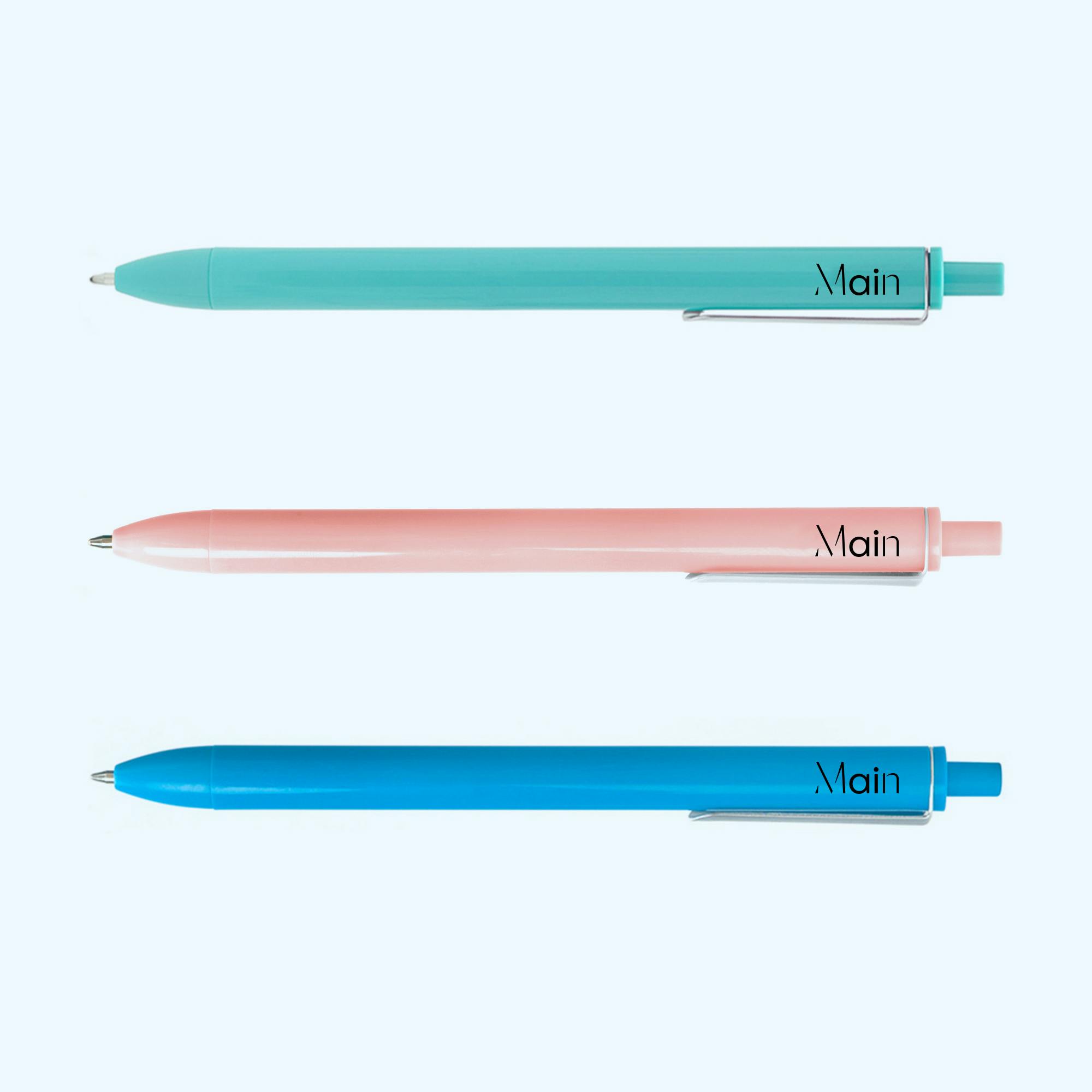
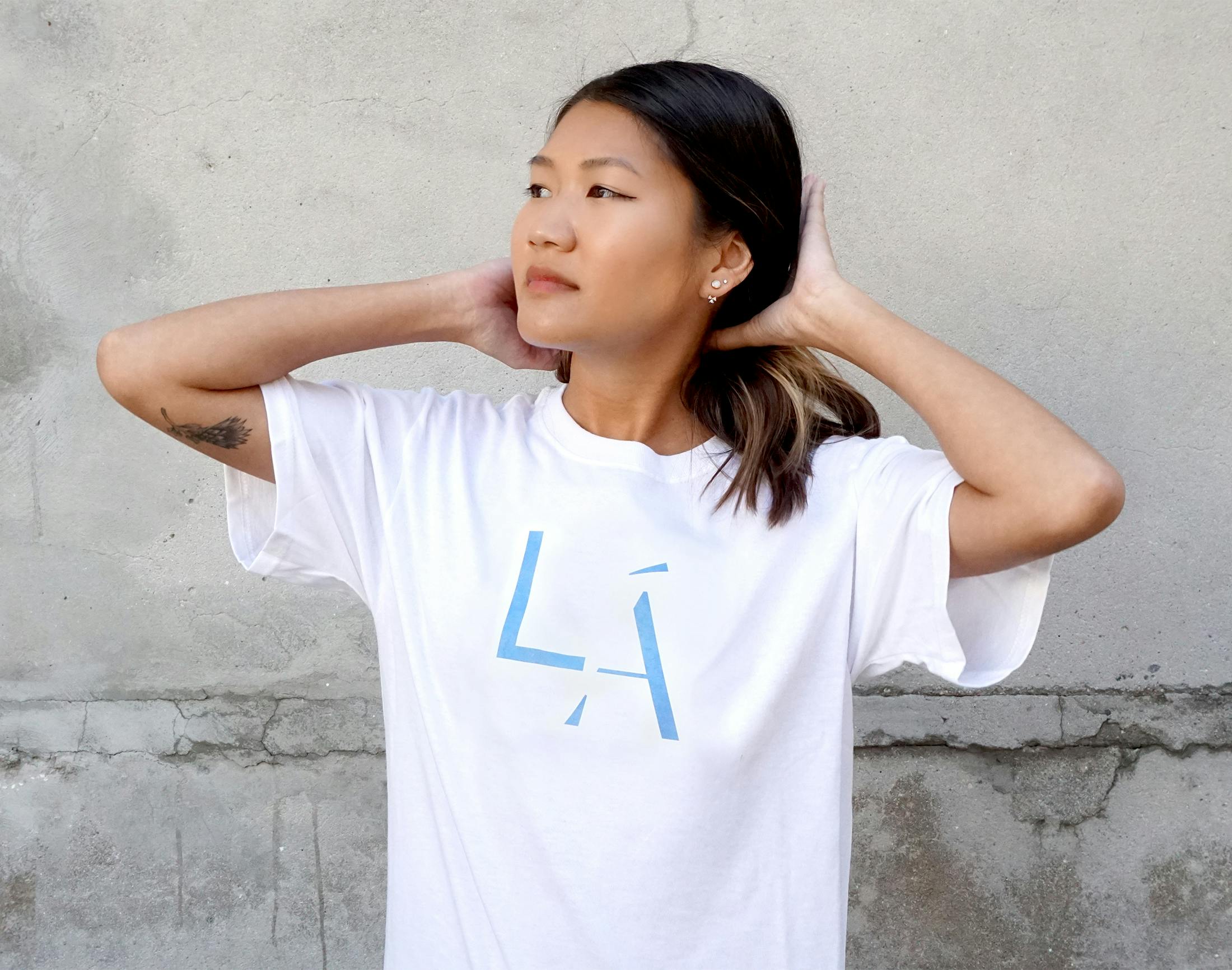
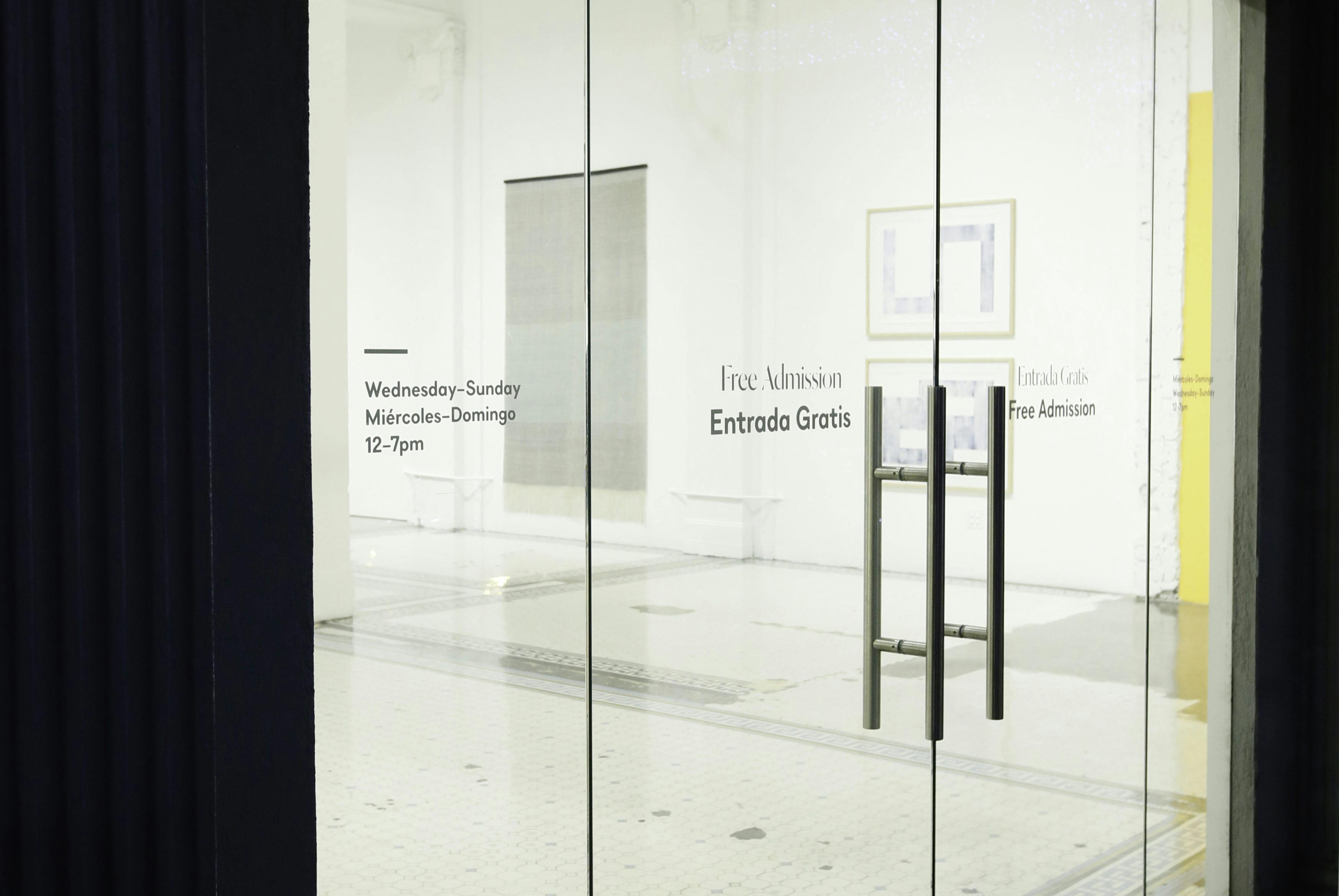
We partnered with downtown LA’s Main Museum to launch their new visual identity, reflective of the bilingualism of Los Angeles and the museum’s goal, inclusiveness in the local community. The Main Museum has been described as a testing-site, embracing the institution’s experimental spirit. We designed a logo for them that conveys the ongoing nature of process and experimentation by leaving distinct letterforms incomplete — a visual motif for a work-in-progress or the unfinished.
Strategic Rebranding Mission: Revitalizing the Image of a Cultural Icon
We were tasked with rebuilding the visual identity of this cultural powerhouse in our native city. Foreground strategy, brand audits, key stakeholder interviews would give way to concept exploration and storytelling exercises aimed at pinning down the most vital characteristics of the museum itself in order to bring them to life in a logo, site and beyond.
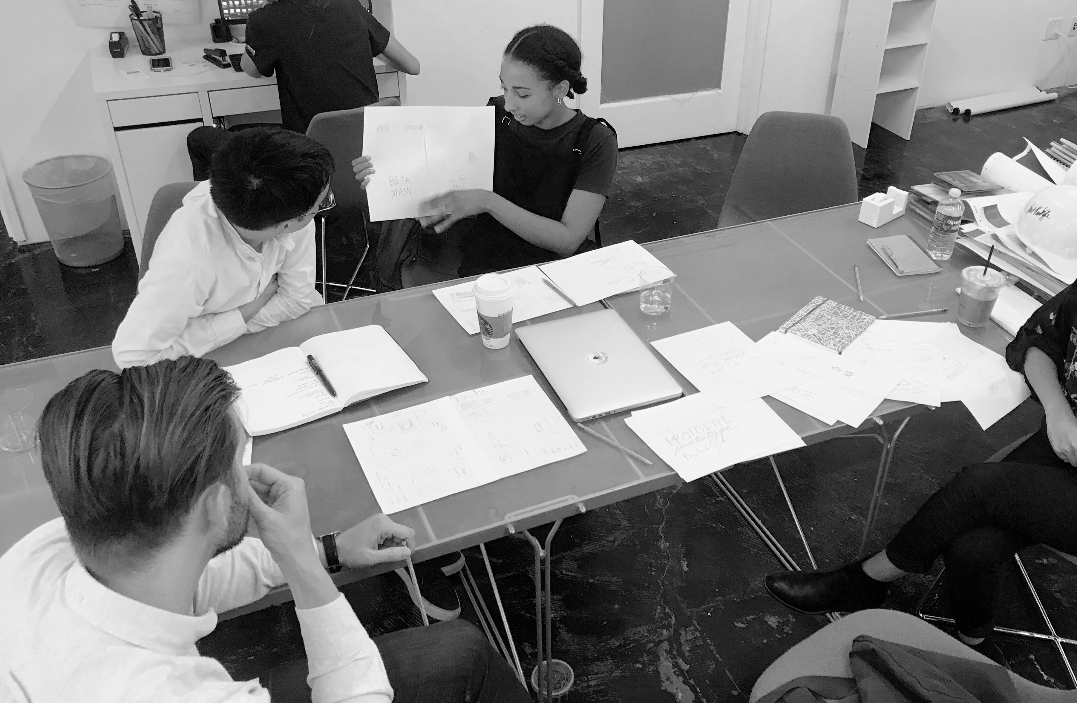
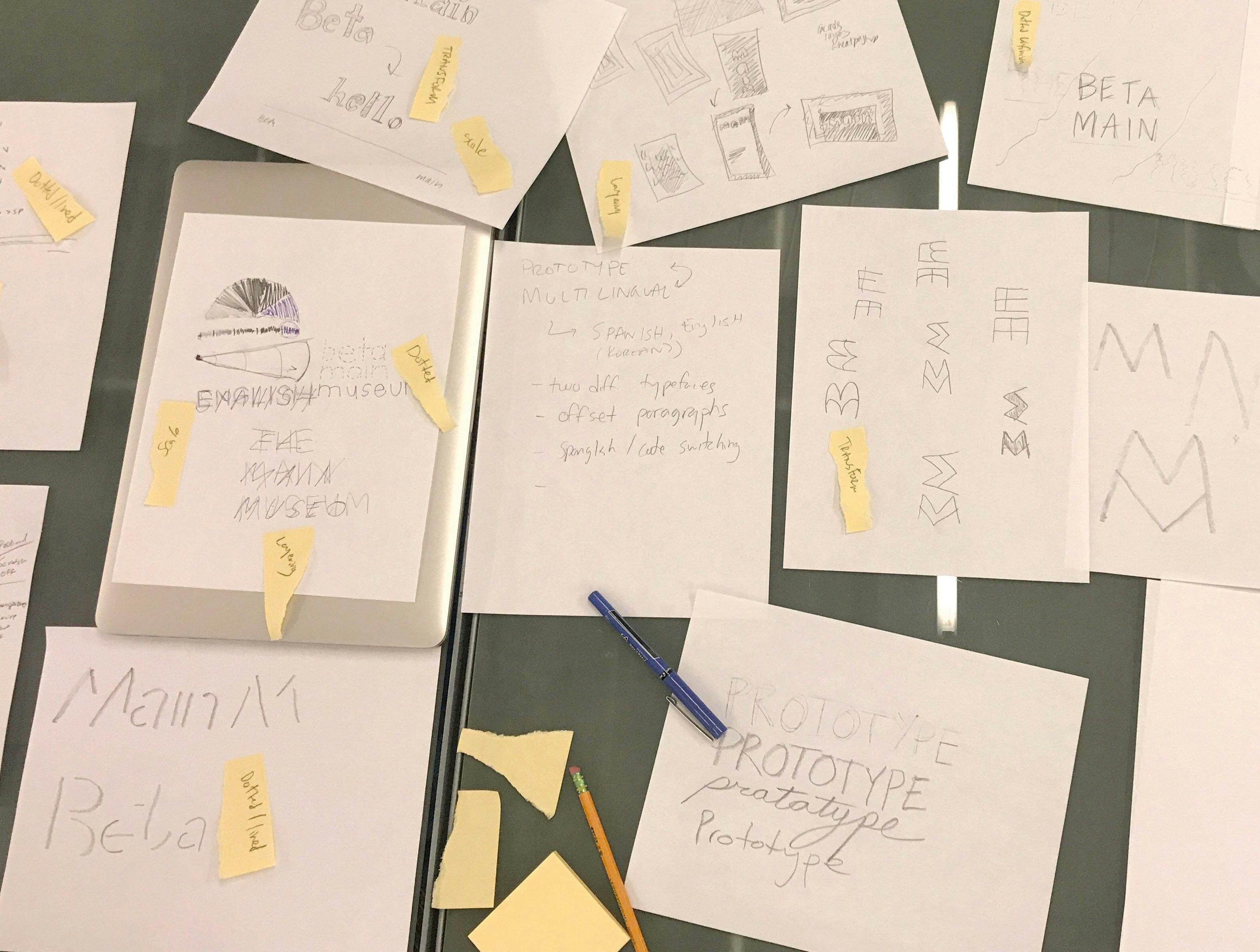
Our Design Process: Merging Art and Typography in Museum Branding
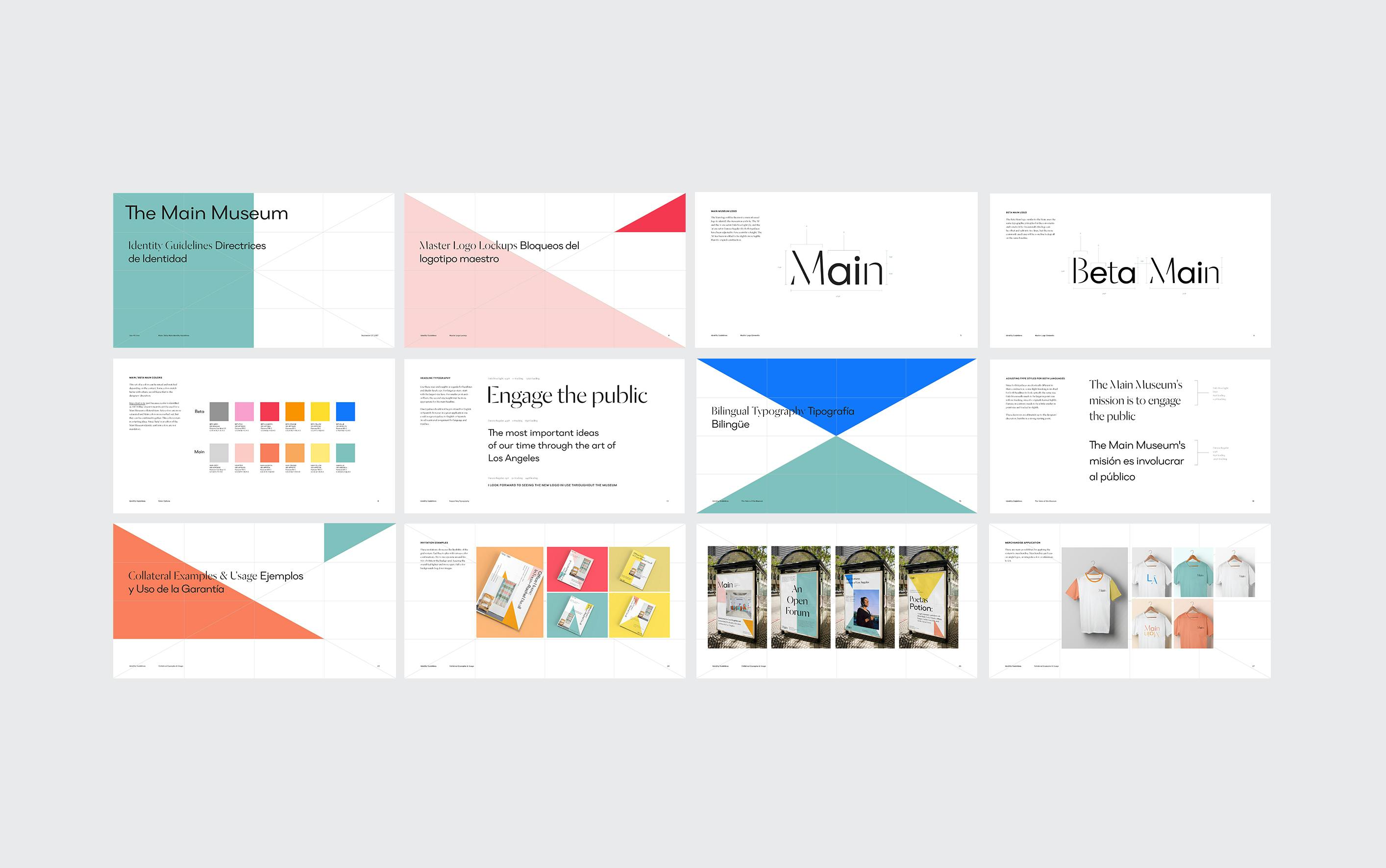
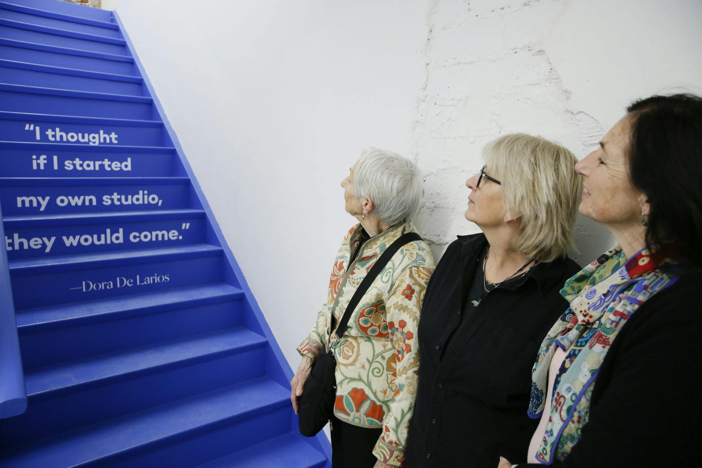
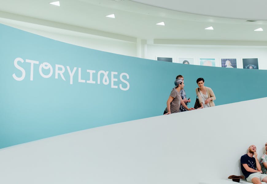
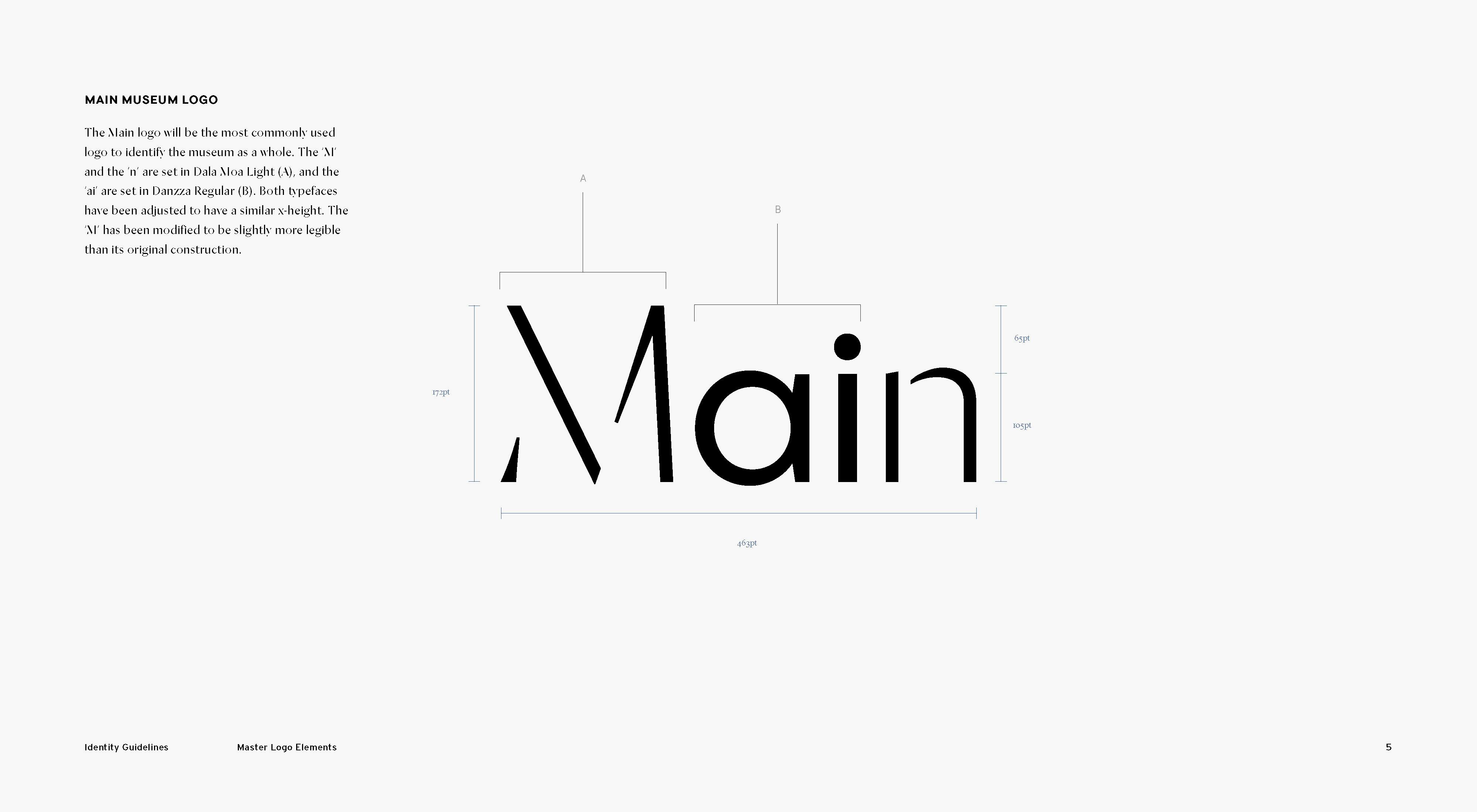
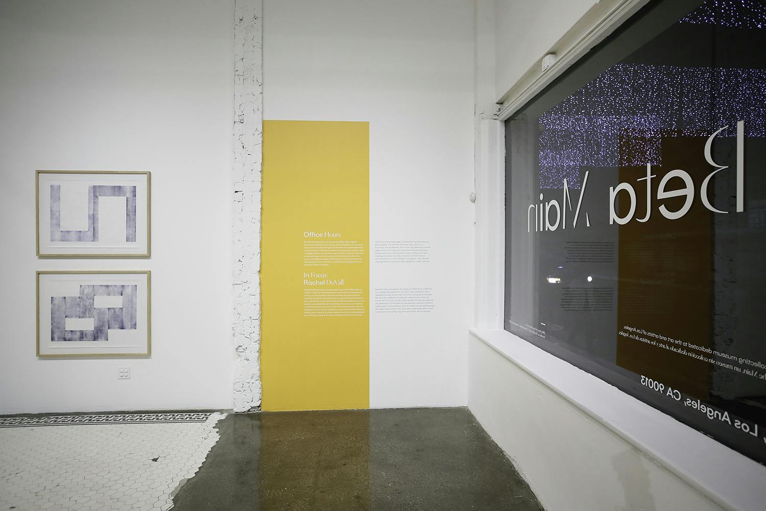
Our early research began with key-stakeholders affiliated with the Main Museum, and it formed the basis for what would become a whole new vernacular and visual expression of the amazing work that they do. The results became a reference point for common language and ideas — an attribute we all referred to throughout the design process. The redesigned logo uses two typefaces: Dala Moa by Commercial Type and Danzza by Heavyweight, with custom treatment to the 'M' letterform for clear legibility. The typefaces are fluid in their usage across the museum’s public-facing materials. For headlines, we offered these two different typefaces that could be mixed together, as an effort to visualize two languages coexisting. Offering both Spanish and English translation is a vital pillar of the Main Museum’s values and communication strategy.
In the identity guidelines, we created a simple underlying grid structure for seamless collaboration with current and future designers. This grid can adjust to essentially any format or proportion. Leaving it up to the designer’s discretion. We gave the core museum team the tools to choose how to activate the grid with type, image, and color. We always encourage keeping the grid structure visible as it illustrates a prototype-like process, displaying how the museum continually composes itself in a variety of creative ways.
The Main Museum's Transformation Through Bold Branding
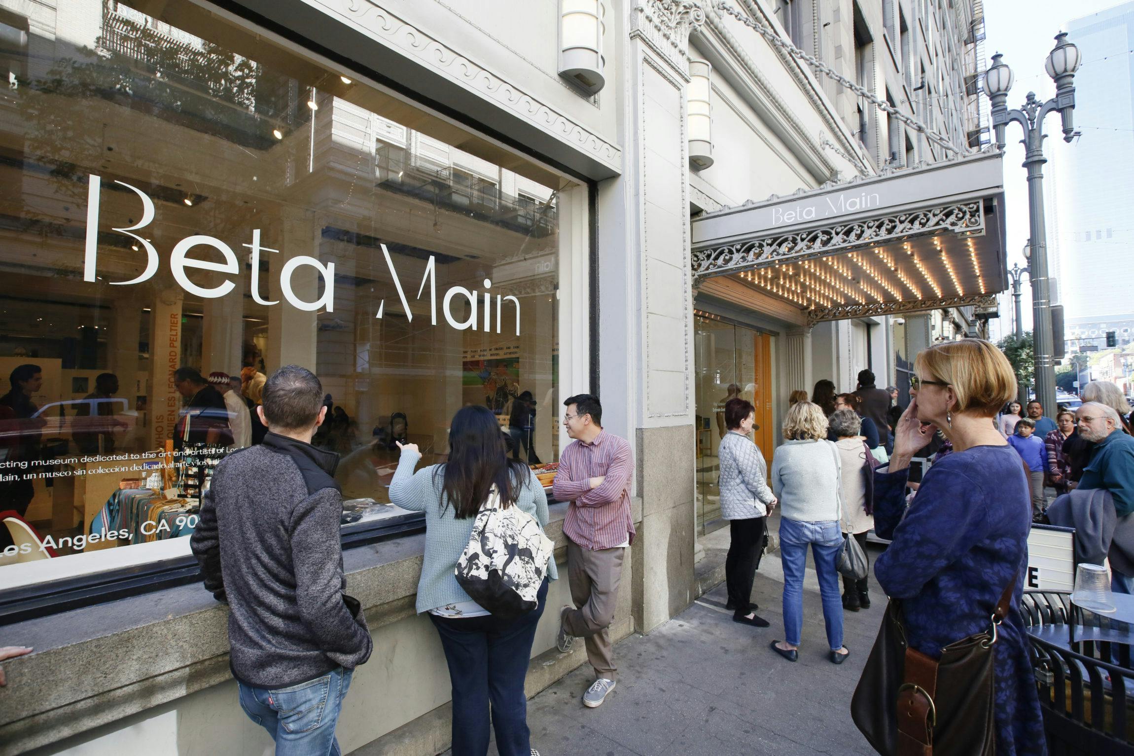
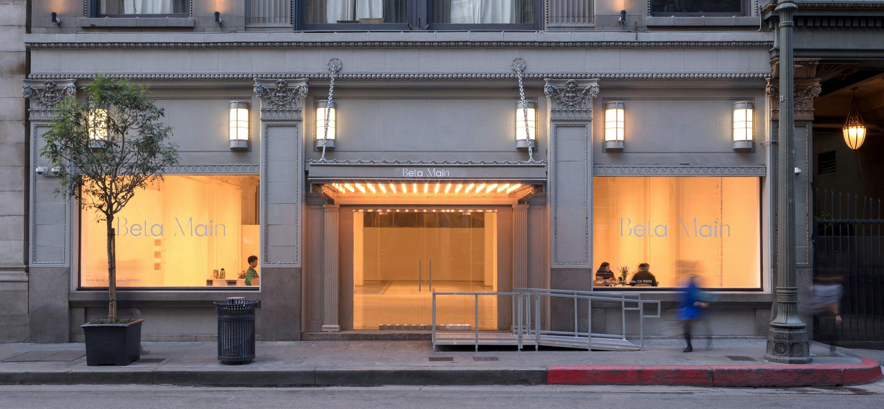
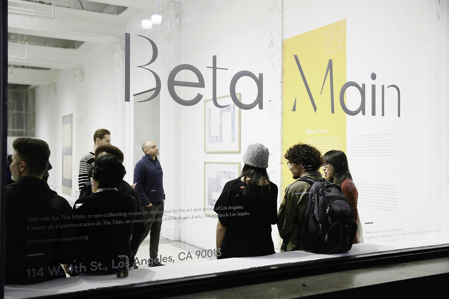
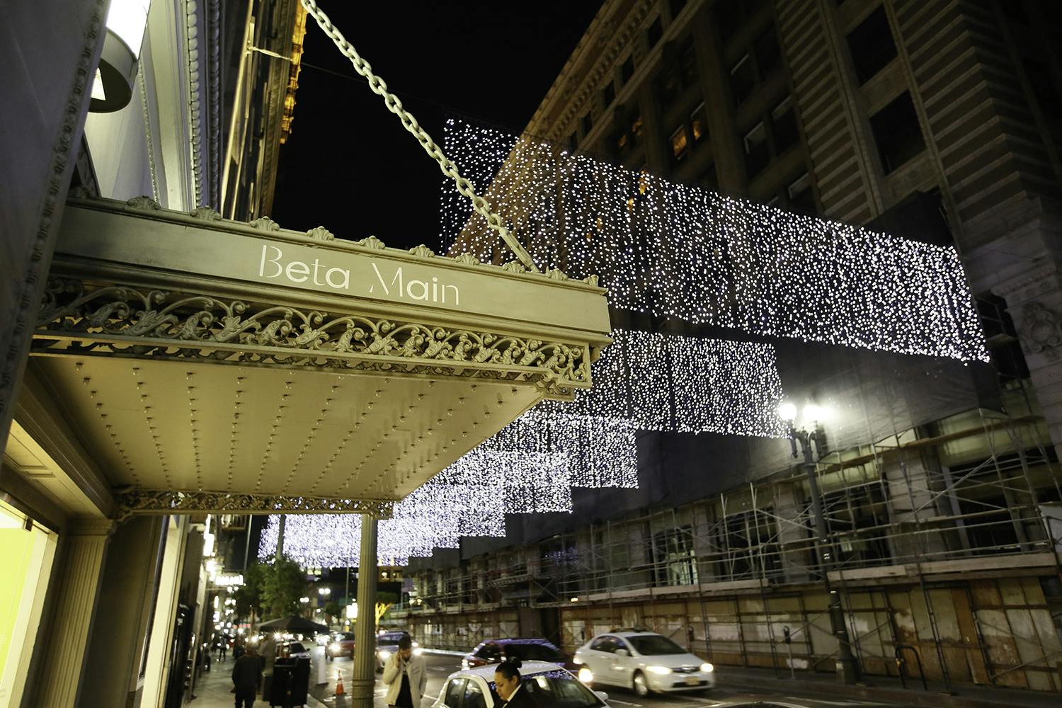
The non-profit, free admission museum unveiled their new identity in a renovated space, which includes galleries and a new program called “Beta Main.” Beta Main is an experimental part of the museum, a place where local LA-based artists-in-residence can showcase their work.
The Main Museum is a nearly 100,000-square-foot space and is the former 1903 Hellman Building and the 1905 Farmers & Merchants Building in the Old Bank District.