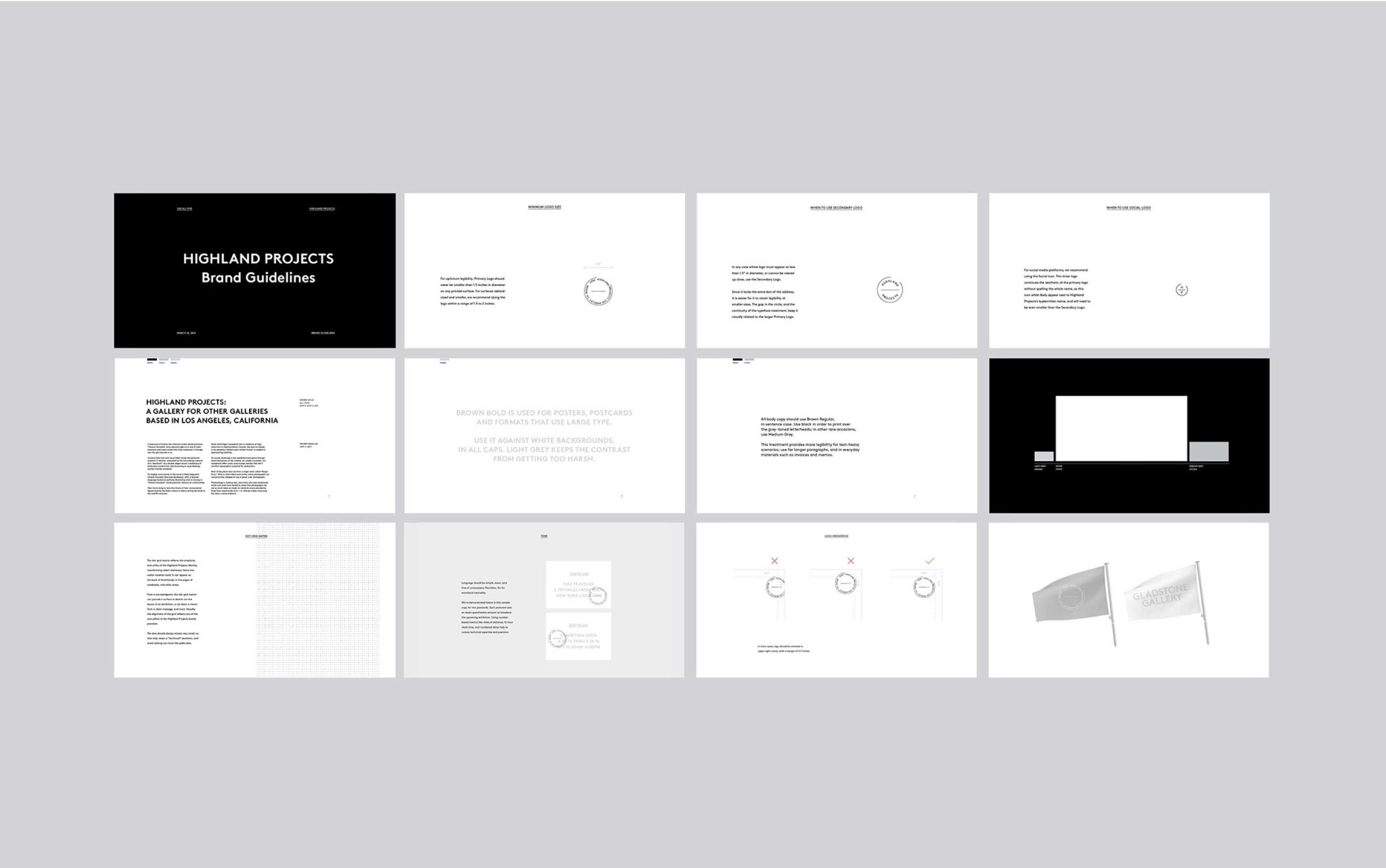
Highland Projects - Brand Identity Design
How can an identity system host other businesses, just as the art space itself hosts other galleries?
Introduction
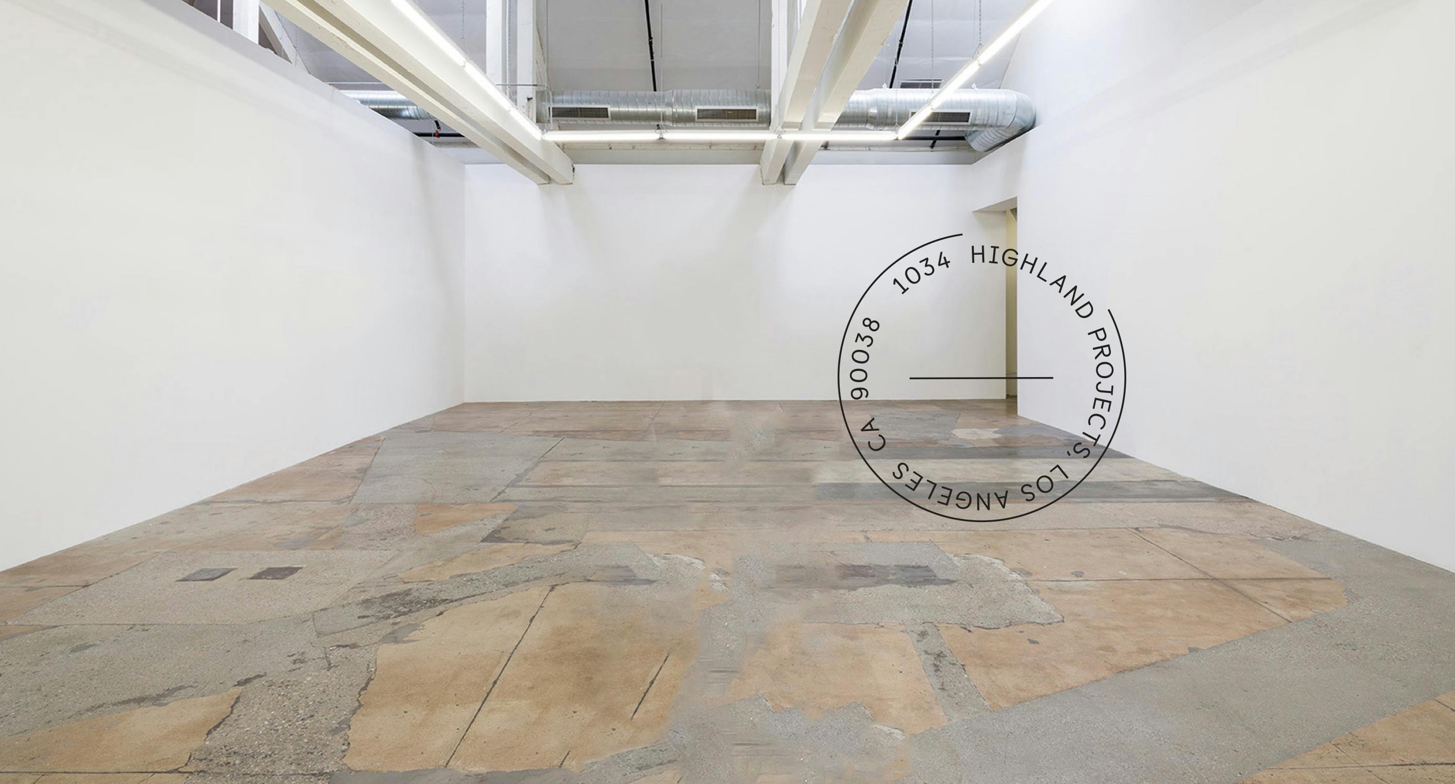
Highland Projects was a concept for an art space that could host other galleries, providing opportunities for galleries in other cities and countries to host exhibitions in Los Angeles. They needed our help to create branding that could reflect the way their business was to function—as the neutral facilitator, rather than the main focus, of content.
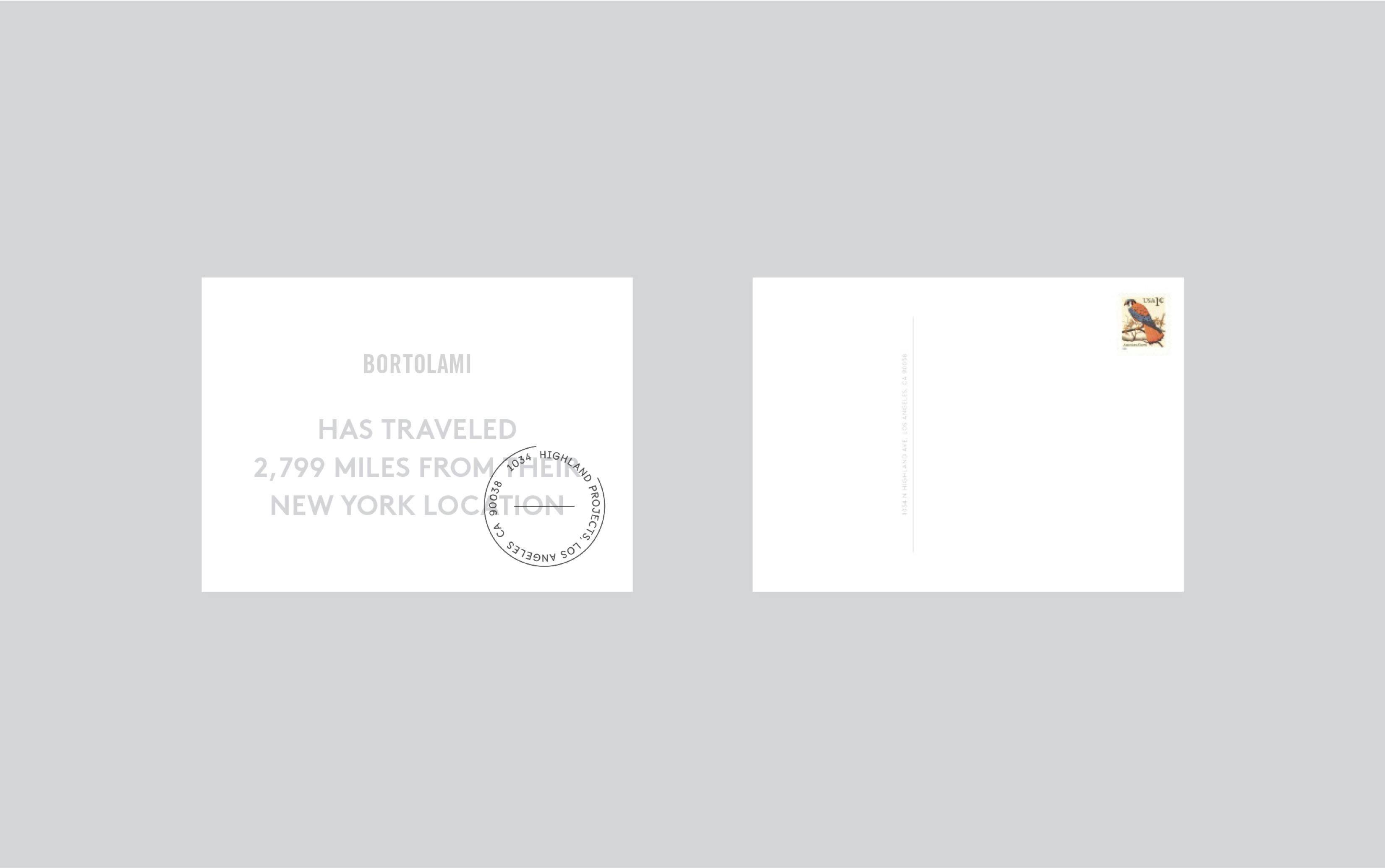
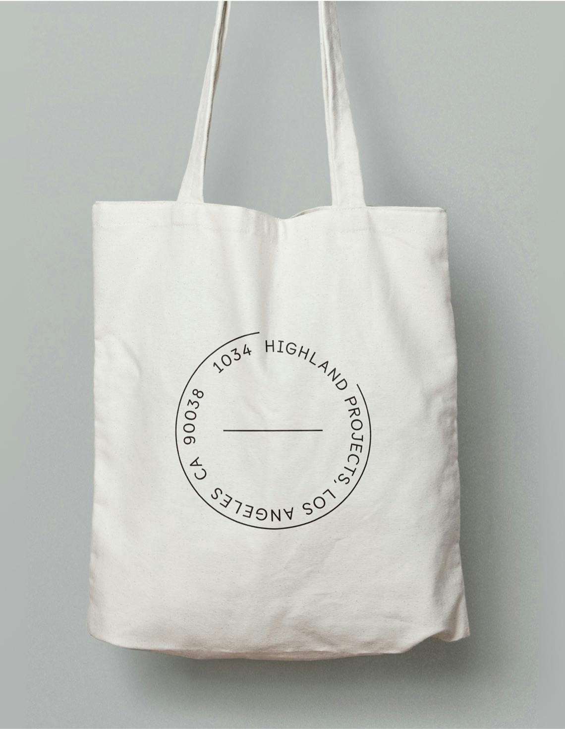
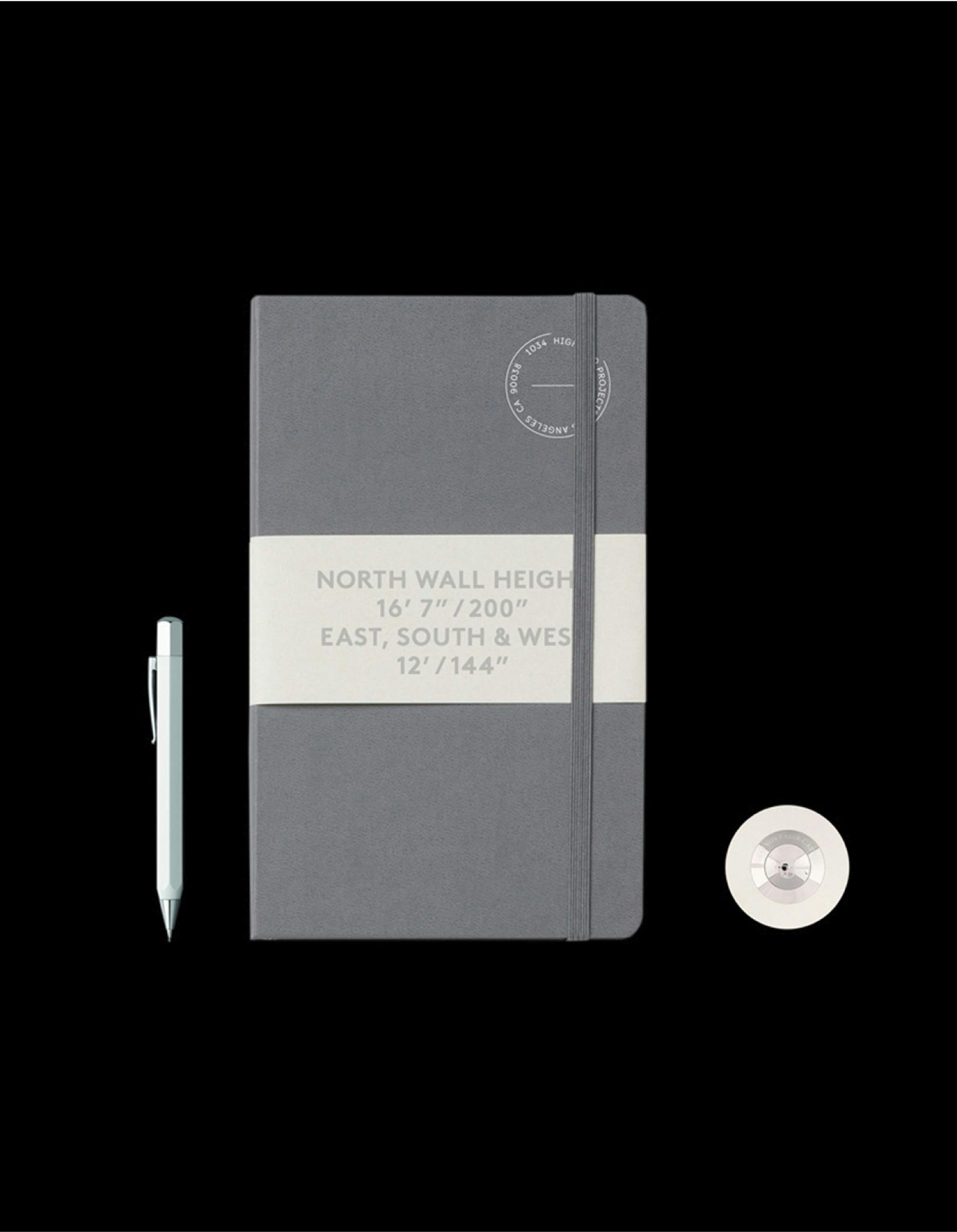
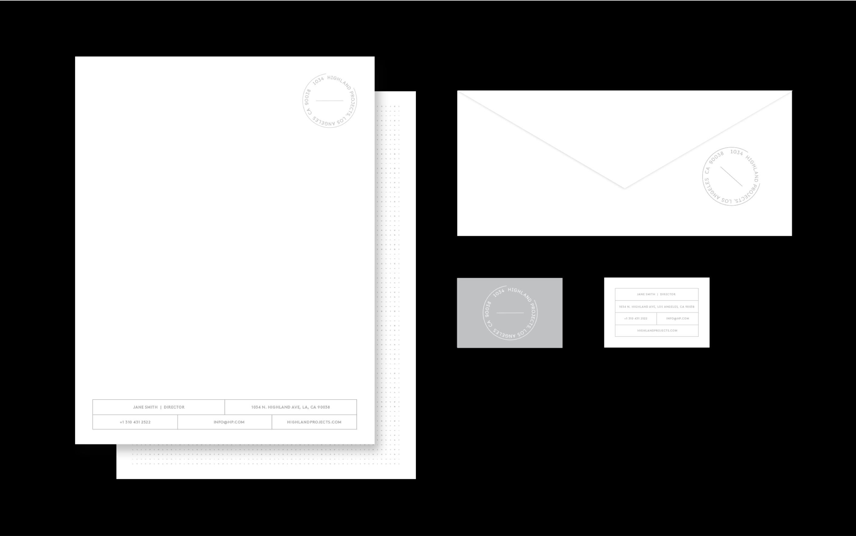
Branding for the space needed to stand alongside, and contain, the content and branding of the galleries that it hosted. To convey this role, we looked to the language of postal stamps. These stamps connote travel, indicating that an item has been safely shipped and processed. We felt that by adopting the language of the postal stamp, the brand could convey the precision, efficiency, and neutrality of the Highland Project business model.
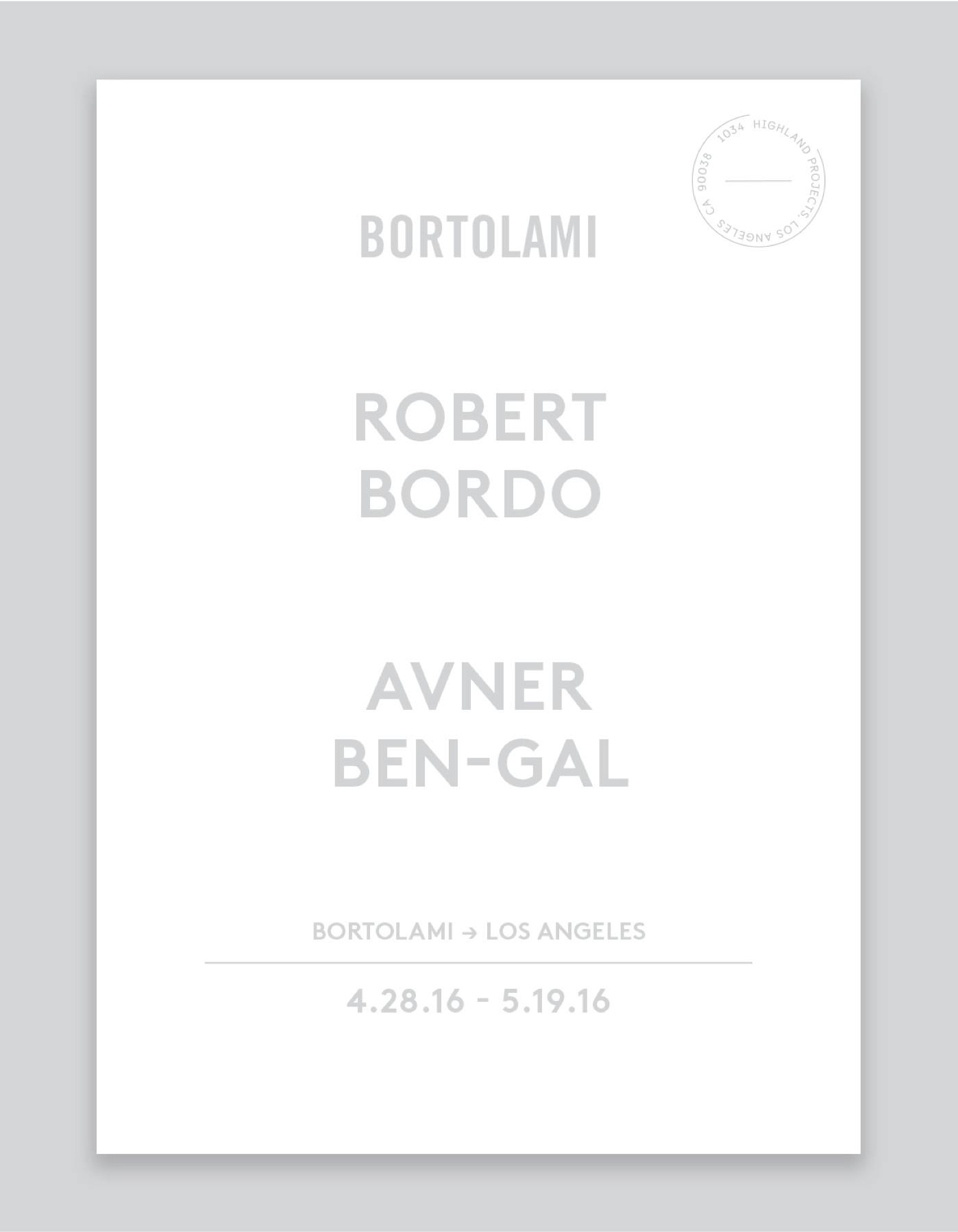
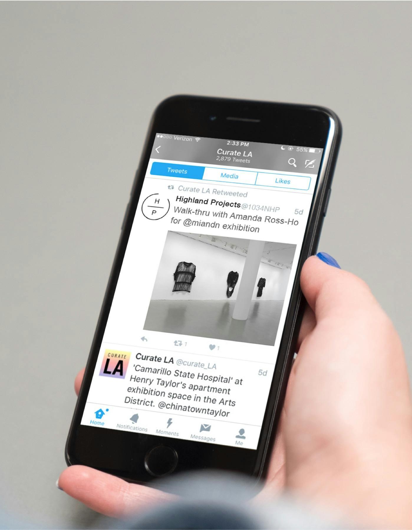
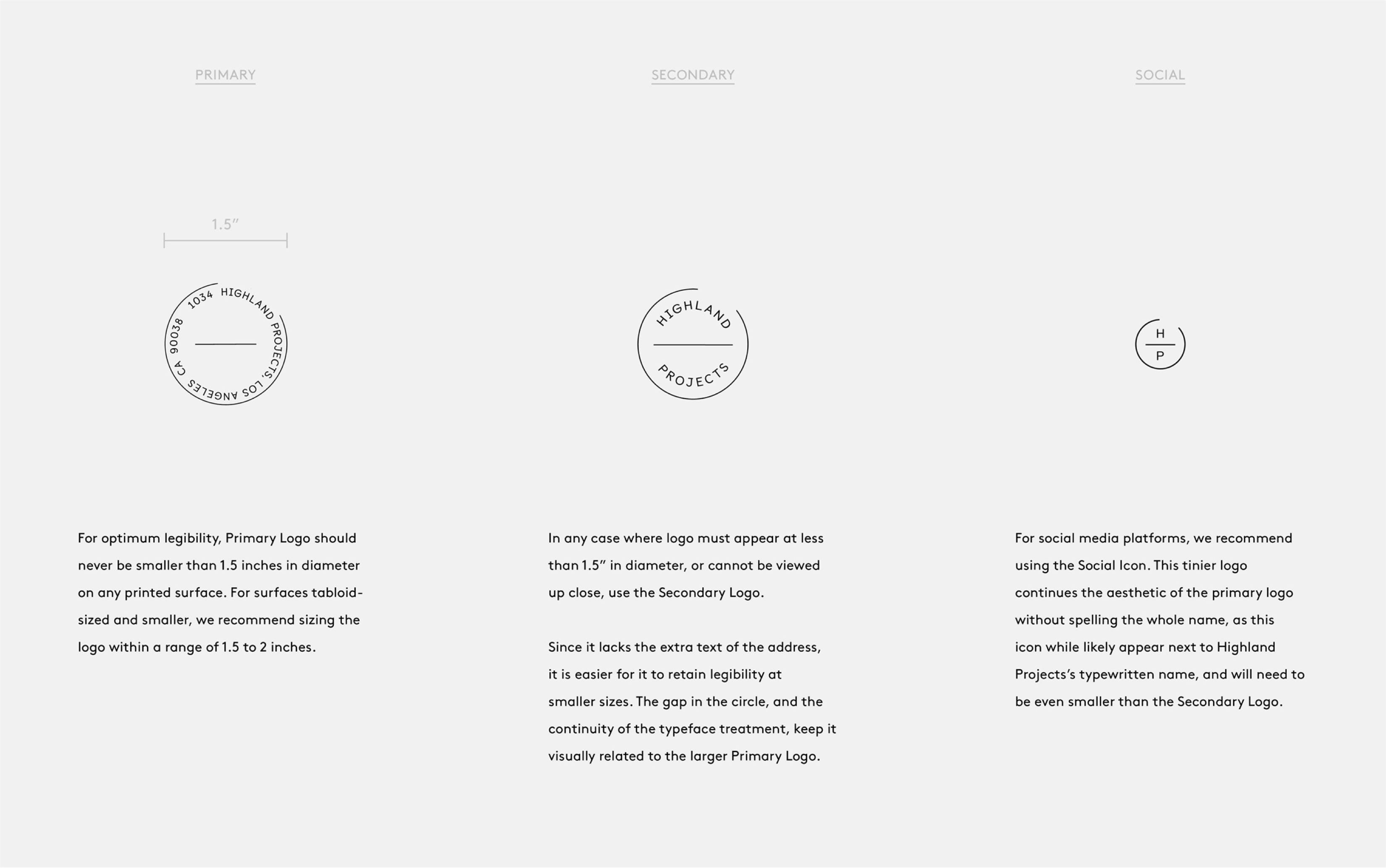
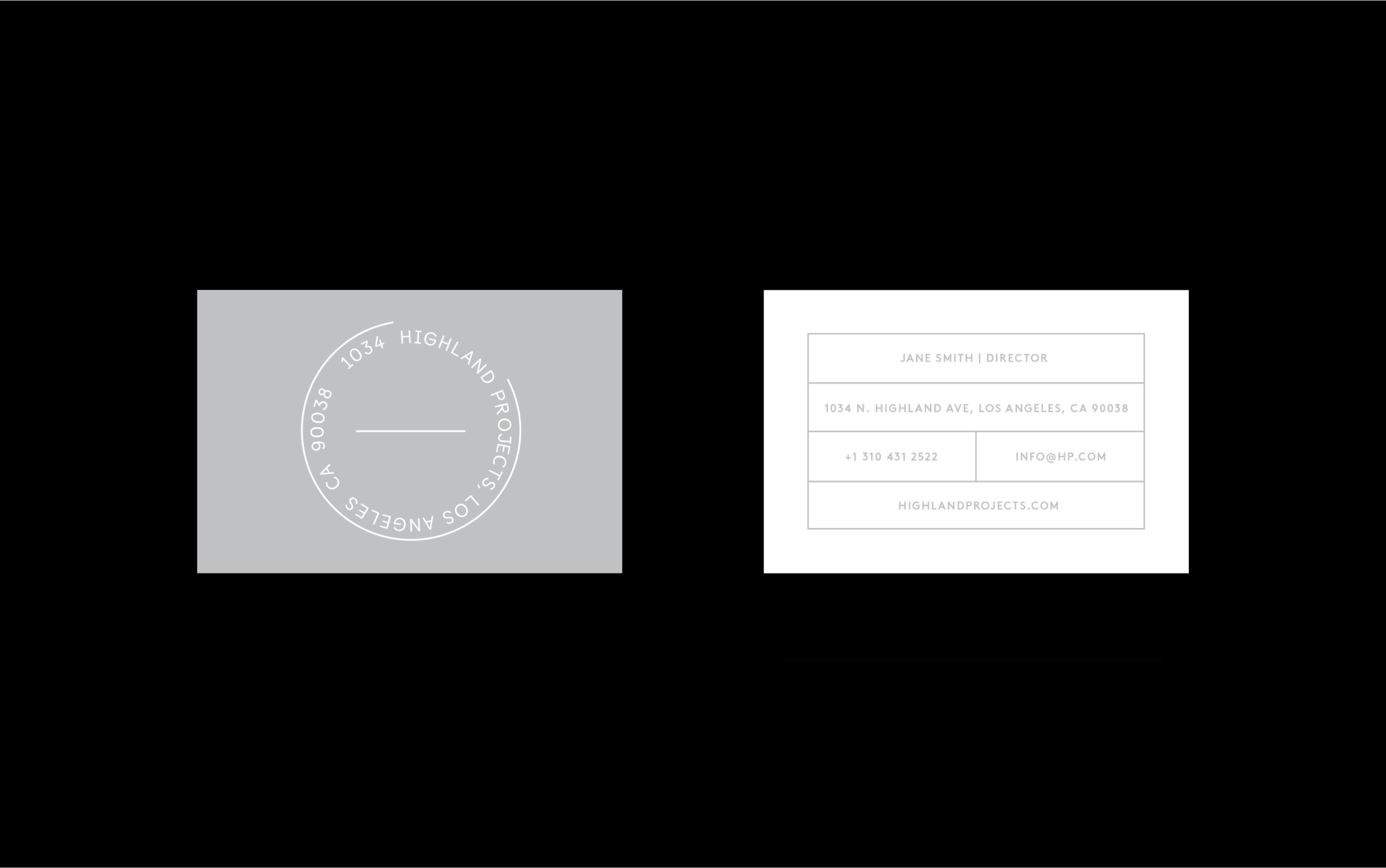
This exploration resulted in a stamp-based logo that could be placed onto and over any content or situation, reflecting the flexibility of the Highland Projects space. Collateral such as posters could place client content front and center, with the Highland Projects logo overlapping. Flexibility was also a central aspect of the physical brand materials. The logo could be stamped over postcards, memos, and envelopes, transforming any materials at hand. The back of the letterhead can double as a notation tool, with a “dot matrix” to enable planning and sketching.
Though in the end the business was never realized, we felt the proposal was a fruitful exercise for both us and the client.